
Case studies
Three clients, with the figures straight out of Google
We only publish what a client has signed off, and we publish the screenshot rather than a rounded-up number in a nice typeface. If an agency shows you percentages with no source, ask for the Search Console export.
No commitment. We reply within one working day.
735 clicks and 33,400 organic impressions in twelve months
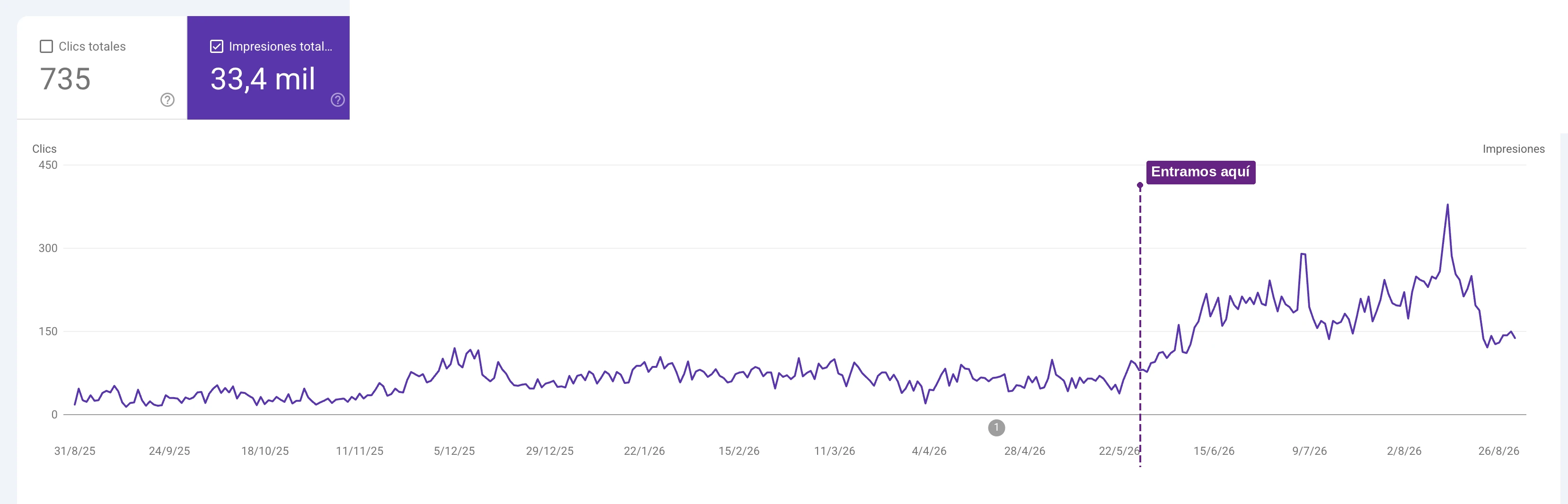
A nutritionist specialising in women’s hormonal health, who came to us through Kit Digital, the Spanish government’s digitalisation scheme. We took over the SEO and those are the twelve-month figures, straight out of Google Search Console.
Two things are worth saying about it. No ad spend sits behind that number — it is organic search only. And the site is on Wix, which people will tell you cannot rank. It can, within limits, if the pages answer what people actually search for and somebody keeps at it. The steady climb starts in May 2026, when we came in.
162 clicks and 10,800 impressions, with 86% of the year’s clicks in the last three months
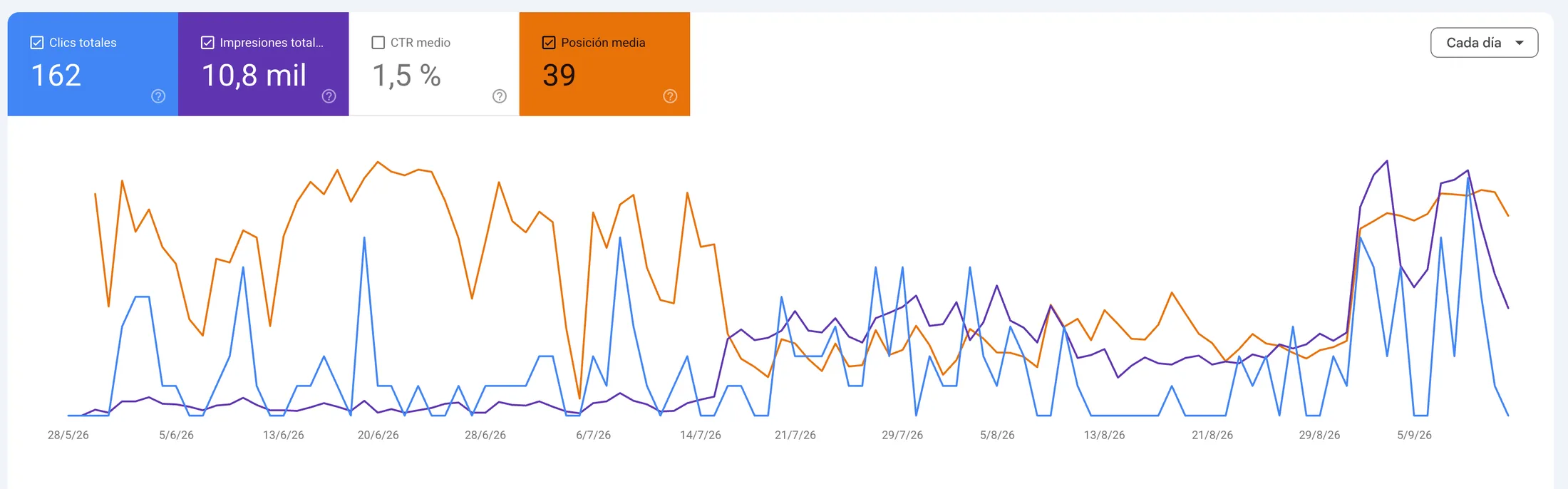
A law firm. New website, measurement wired in from the first day, then SEO. The figure that matters here is not the total — it is the shape of the curve.
86% of the whole year’s clicks landed in the final three months. That is what SEO looks like when it starts working: nothing much, nothing much, nothing much, and then everything at once. It is also exactly why we put six-month targets in writing rather than three-month ones. At ninety days this account would have looked like a failure.
A new identity, brand manual, applications and website for a wholesaler trading since 1960
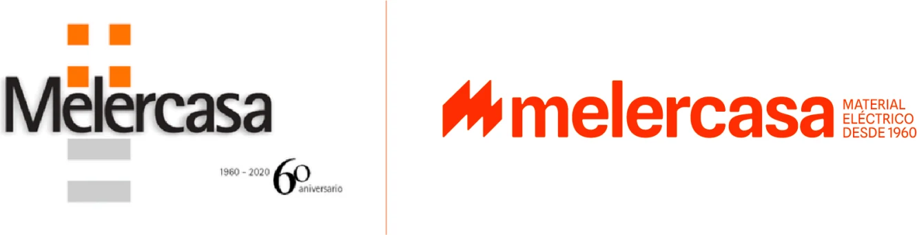
An electrical wholesaler that has been supplying the Canaries since 1960, with a logo that had stopped saying anything about the business. The old one had the tell-tale sign: a "60th anniversary" badge stuck on beside it, which is what you do when the brand cannot carry its own history any more.
We rebuilt the identity rather than tidying it. The name dropped to lower case and gained weight so it reads at a distance; the symbol became an M drawn as three zigzag strokes — current, without resorting to a plug or a lightning bolt; and "electrical supplies since 1960" moved inside the logo itself, so the sixty years travel everywhere the brand goes.
Then the brand manual and the applications, which is where an identity is actually judged: site hoardings, packing tape, workwear and stationery. The website is built and waiting on final content.
5.0
Reviews from our Google profile, translated from Spanish.







Get a free marketing review
Tell us your website and what you want more of. We will look at it properly and come back with what we would do first — whether or not you hire us.
Please check these fields before carrying on: